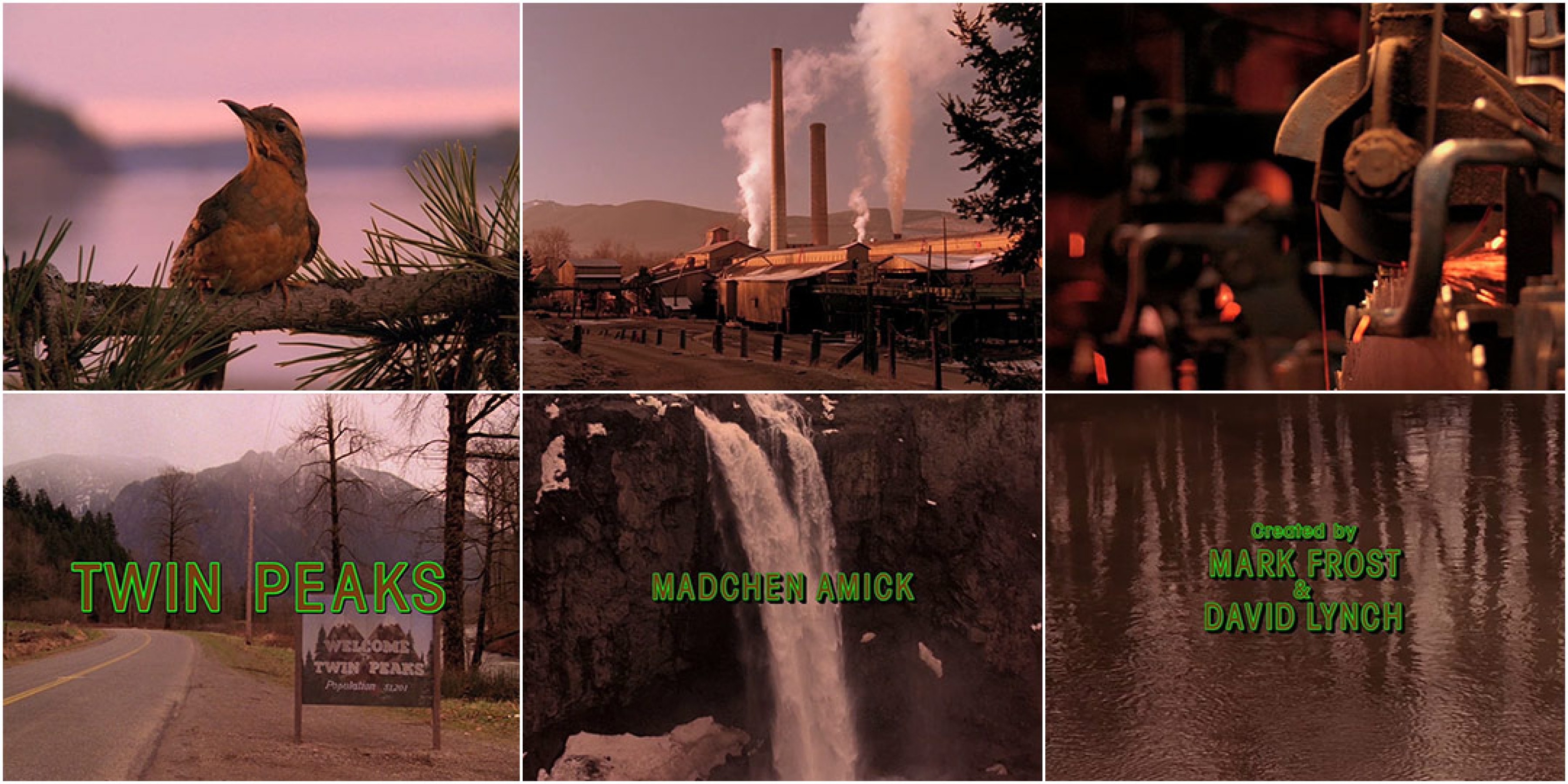
Twin Peaks: damn what a show, and what a title sequence! One worthy of Florian Hardwig's brave font ID-ing in the comment section of Fonts in Use. Fifty-two letters should give you plenty of unique DNA to work with for identification, but it turns out the difference here comes down to the leg of the R and the skeleton of the K. Which says a lot about the Condensed Sans landscape. In the wider, more traditional-width fonts there's a lot you can do to differentiate by varying letter spacing or proportions, but where straightforward condensed gothics or grotesques go, most designs look similar.
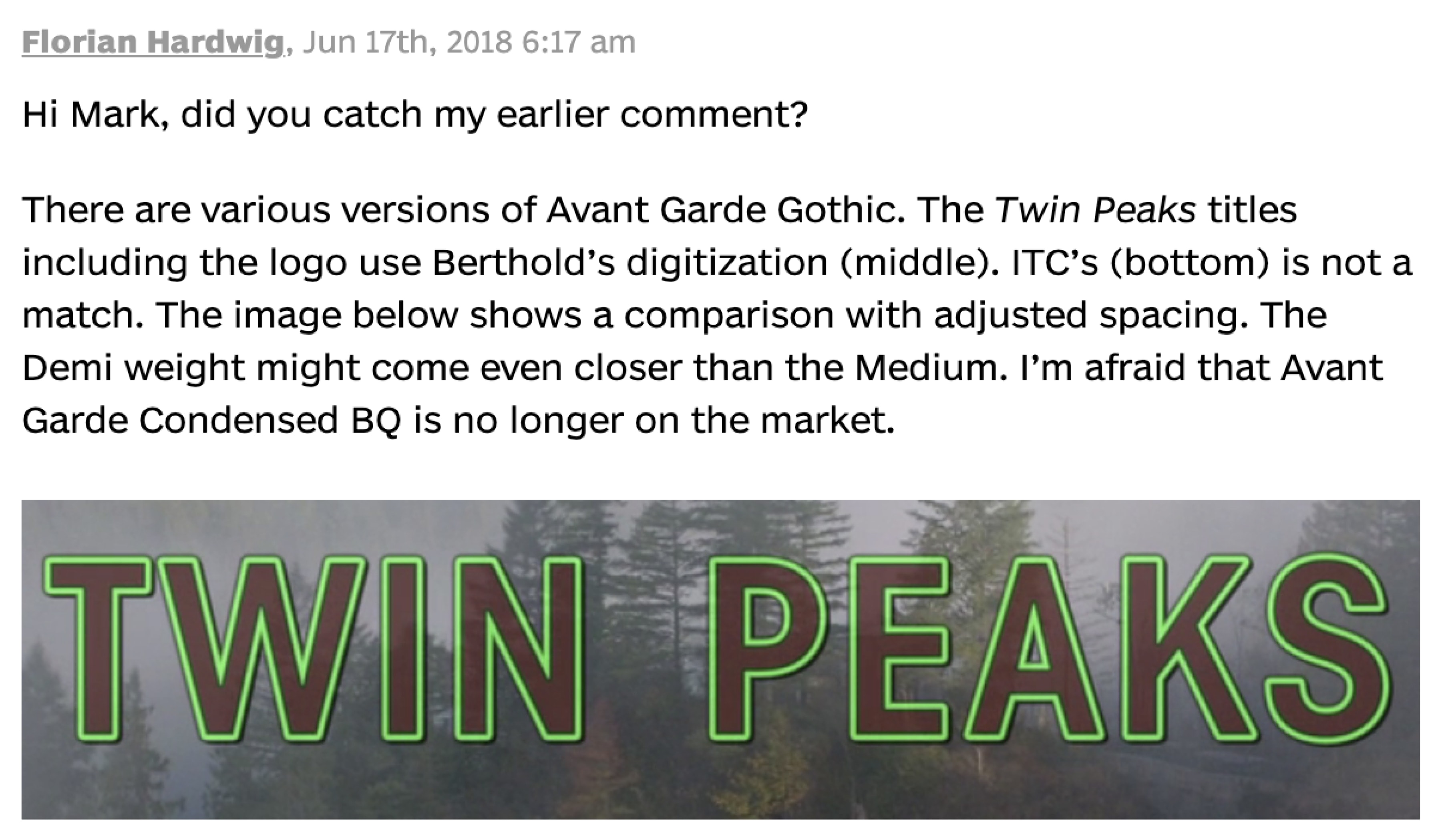
The Twin Peaks title font, ITC Avant Garde Gothic Condensed, is a distant cousin of the famous original width created by Herb Lubalin and Tom Carnese. In contrast to the Lubalin/Carnese version, it has youthful, superellipse-ive curves drawn by Ed Benguiat (among others). Prior to two months ago, I had forgotten it existed. And in this rediscovery, the lack of relationship between Lubalin’s tight, interlocking, one-stop logo-maker, and the loosely spaced, not particularly condensed, and (perhaps most important) traditional letterforms seen in Twin Peak’s titles stood out to me.
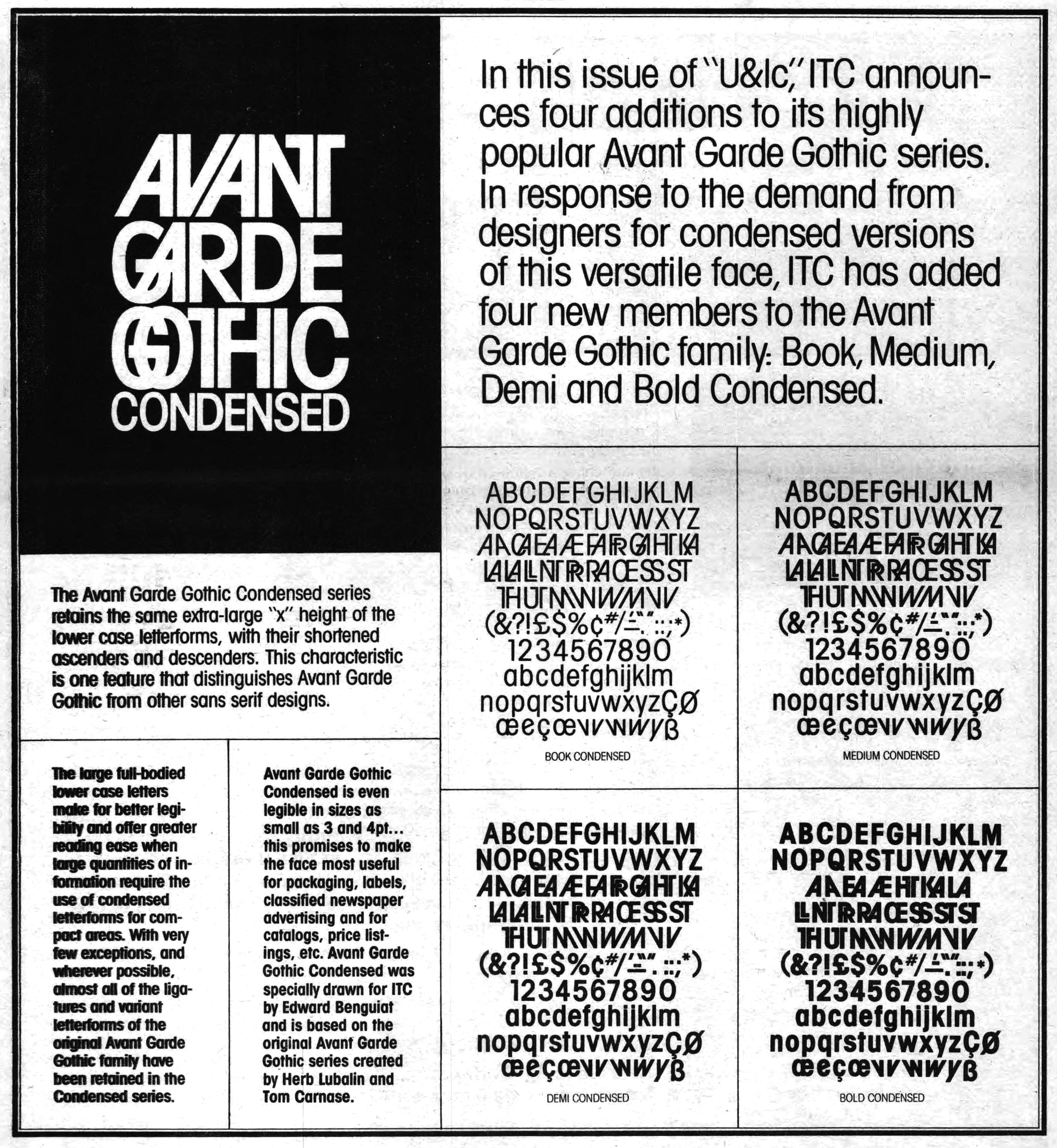
In the marketing, the value is clear: Avant Garde Gothic Condensed has all the fun of Avant Garde, now with a little less wide. The design is now nearly fifty years old, but its use cases have rarely included those readily identifiable interlocking letters. In the year 2000, when ITC brought the family into digital they didn’t even take the time to include those notorious ligatures in the Condensed styles.
I guess you could say I know a bit about Gothic Condensed fonts. I made one myself in 2014. And I released v0.1 of another on Future Fonts today.
Little surprise, that 2014 design was sign-painter inspired. I spent all summer and fall designing the letters then proofing them with squirrel hair brushes and One Shot in the drafty carport attached to my one bedroom apartment. I was so proud of it. I used it to apply for the Type@Cooper condensed program, which I attended in the summer of 2015. It took about a week in the program to realize I would never release it. In a flash, a year’s worth of work transformed from living art to soulless cadaver. I don’t know how exactly, but the program gave me the eye to see my work had all the necessary human-stuffs, but none of the human. In other words: plenty of tone but no voice.
Let me explain what I mean here. “Voice and tone?”, you’re probably screaming at your computer, “I thought we were talking fonts!” Well, yes. But, nothing is as message obscuring as type terminology. Maybe I’m just not a technical writer, but I’ve found those words have a way of reducing all the pleasant nuance down to a matter of taxonomy. When I can, I try not to use them. Instead, here, I’ve opted for a voice/tone framework. Tone is the way something is said, voice is the person saying it. It’s a bit simplistic, but at the least it’ll keep me from killing the mood with words like “bezier” or “soulless cadaver”.
Here’s an example from my other favorite craft: music. When songwriters try to sound like Bob Dylan, as they so often do, everybody can tell. Not just other songwriters. First because Dylan isn’t great at singing (as we learned with the Traveling Wilburys), and second because poetry isn't imitatible (as we learned with the Traveling Wilburys). The nearest thing to his magnetic idiosyncrasy is just doing a bad job. Everything closer after that dips lower and lower into that valley of uncanny human-stuffs cadavers. Many can mimic the Dylan tone, it's much harder to take on the Dylan voice.
But, choose to sound like Dylan or not, everything crafted gets a gloss coat of charming, imperfect humanity—or, in other words: voice! And voice is difficult to hide, but impossible to fake. You can’t fake poetry, and you can’t take the humanity out of a letterform.
Which brings me back to my failed condensed gothic. At that time my phone’s photo album was filled with bizarre ligatures or flourishes—exceptions to what I understood as rule. These odd discoveries made type feel spacious enough for my inability. But the letterform variety show gets old fast. And, after my eyes got adjusted by Type@Cooper, I had the troublesome problem of seeing something lovable about all letter art—not just the big tone, over-the-top, fun stuff.
Though you might not see it in my work, these days what catches my eye is a bit more modest. I’m especially drawn to examples of a well-trodden genre with a small but convincing exception. Like, for example, the credits of Twin Peaks, where Benguiat’s ITC Avant Garde Gothic Condensed’s apertures stood out to me for being nearly closed. I’ve grown to crave those evidences of a craftsman (Ed Benguiat, in this case) in a moment of deviance (always, in Ed Benguiat’s case). In the case of ITC Avant Garde Gothic, it's those nearly accidental bits of voice which has survived (not the ligatures).
These deviances are easy to spot, but difficult to reproduce. I have lucked into a few pleasantly human-like idiosyncrasies over my short career. Put in the time and you'll eventually get struck by lightning twice, or something. Do what you like! Round some corners! Add a few tails! Create an inline style! This is all tone. And it’s lots of fun.
Tone proves that with enough effort anyone can make a name for themselves while creating some distance away from your competitor’s more ubiquitous takes. But, in my experience, that's about all it'll do. That affection for tone (for, oh, say, hand painted signs) may help market your font, but it isn't gonna help when you're stuck on how to draw the leg of an R or skeleton of a K.
It’s sticky business to find those voice questions when you’re in tone territory. Unfortunately, tone never does have much of an opinion to assert. Tone may have made a song memorable, but it’s voice that made it in the first place. And voice, craft, just takes time to see and understand. You can learn why that song you love is so good once you can write one of your own—and by that point, you might love your own voice enough to not worry about it.
Okay, I'm rambling.
Let me try to sum it up. I’ve grown less certain of my creative decision-making abilities in time. I started my career with a confident perspective, trying hard to goof things (with tone) to imitate the expressive work I admired. But my natural uncertainty has been a force multiplier that has ensured even my most mature work risks the carnivalian at worst and produces something mildly cheeky at best.
I’ve learned my voice is difficult to hide, and impossible to fake. My natural uncertainty only shows up at the right measure as I’ve stopped trying to overwrite it.
I can't pretend to understand voice, or how it grows in time, or integrates with trends, or what to do when it fails you. Worst of all, I'm not sure there's anything instructive to be learned from Bob Dylan having made plenty of uninteresting work, and Leonard Cohen consistently striking lighting twice (or whatever).
For that, I'm trying to worry less about how my decisions might hold up in the marketplace, against the curious font demand-supply chain. Some might call that privilege, and maybe that’s so. Whatever it is, I'm tired of calling it anything but me. The universe is mysterious, spontaneous, and prolific. I believe anyone can align their ways with that movement.
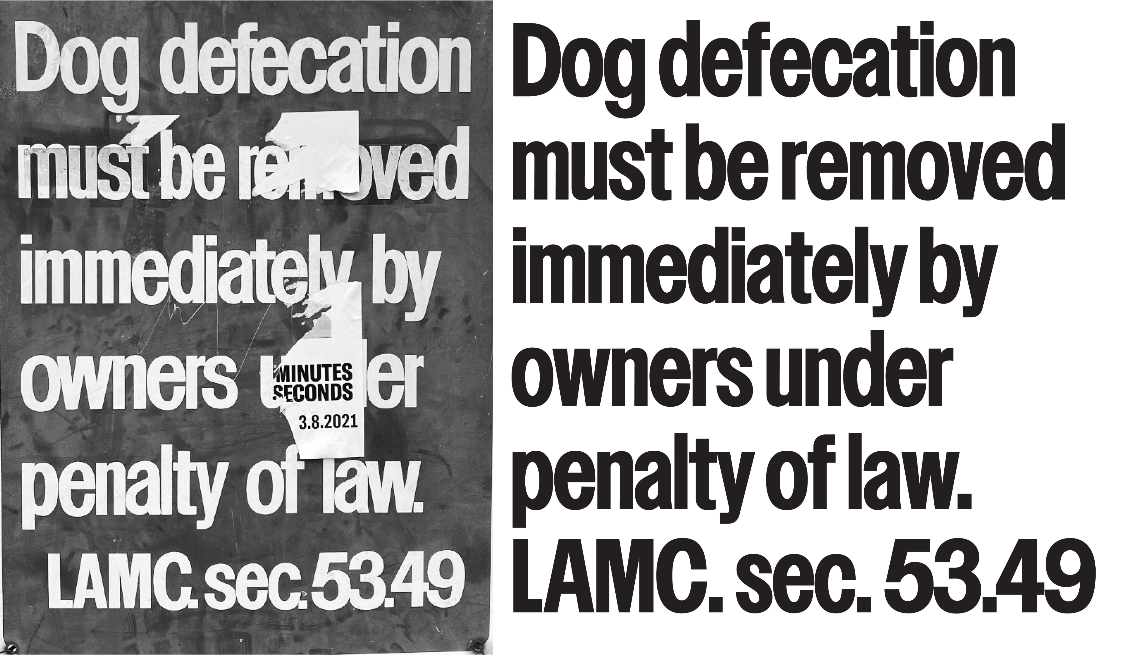
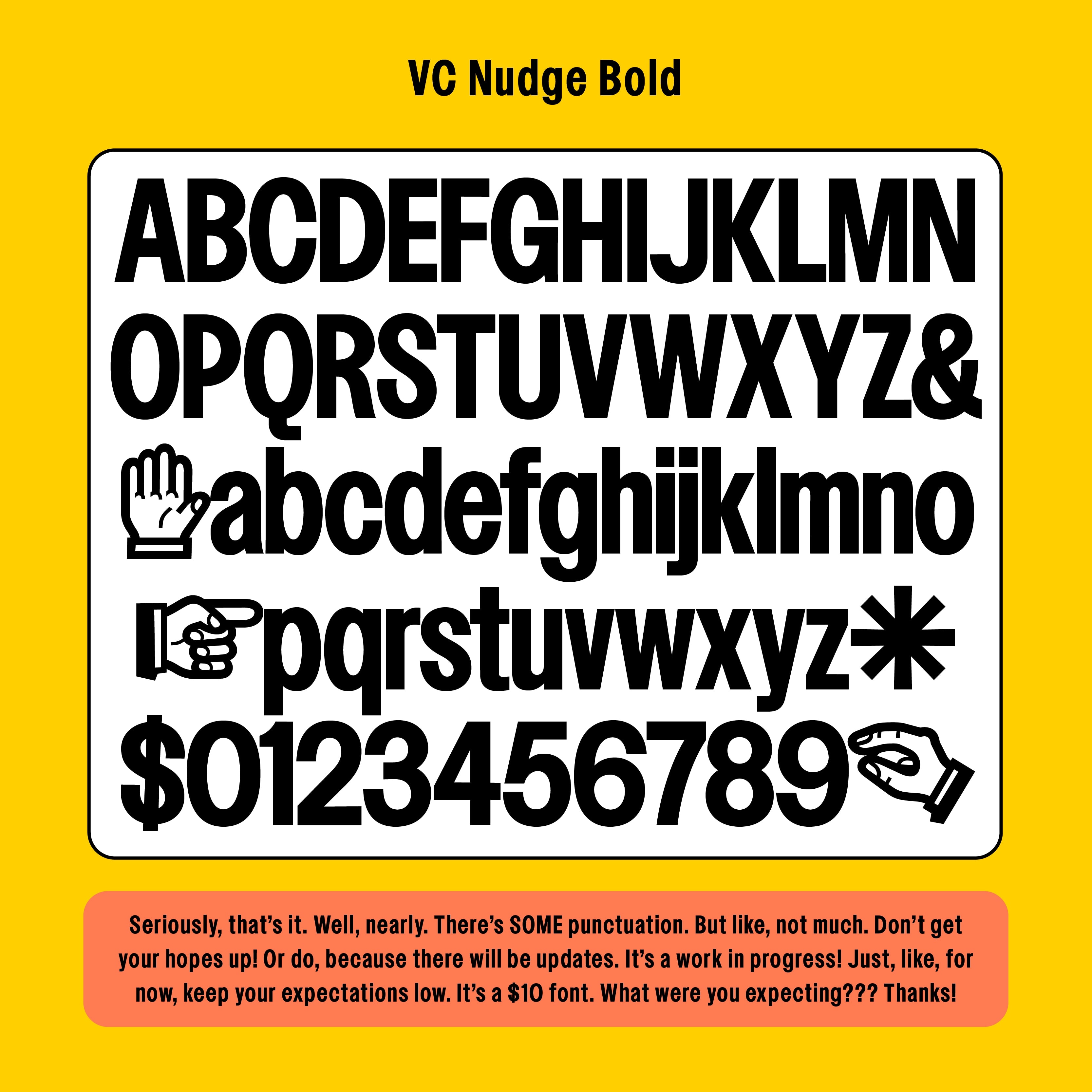
So here’s Nudge. I don’t have many font things to say about it. It’s a condensed gothic sans. It's a design based on a dog defecation sign composed of letters hand cut out of vinyl which I saw at Silver Lake Reservoir¹ in LA. It stood out for having an uncharacteristically narrow n shape, and nearly closed apertures.
Nudge is named after a verb I use to describe hand-kerning. Spacing/kerning is at the foundation of how most good type works and I love technologies like Letraset which threw that broom out with the dust and allowed some play.
Nudge is in that vein. The contrast is low, the tapers are hardly visible. The rules feel a little broken, I'm not keeping track of which.
Hope you enjoy it.